HTML & CSS Tutorials on Codecademy

To gain some experience and learn the basics in website coding we did the tutorials on the website Codecademy for HTML and CSS...

What is HTML?

HTML (HyperText Markup Language) is a computer language that allows a website to be constructed using this coded vocabulary. This code/text is saved as an HTML file and viewed through an internet browser. This browser reads the file and translates the text into a visible form, hopefully rendering the page as the author had intended. It allows anyone with an internet connection to view this content that is made up of abbreviated words surrounded by symbols that correspond to elements of a website (website links, lists, linked images, shapes, buttons...etc.)

What is CSS?

CSS (Cascading Style Sheets) is a style language that defines layout of HTML documents. For example, CSS covers fonts, colours, margins, lines, height, width, background images, advanced positions...etc. It is used to format the structured content made in an HTML file in great detail and control over the fine details of the page and all of its elements.

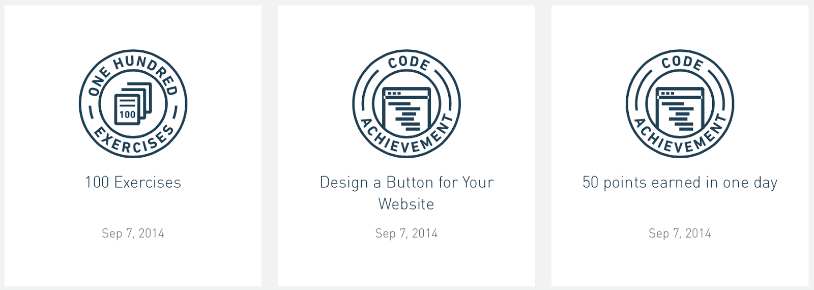
Evidence of Completion:


Badges Earned:


What is JavaScript?

JavaScript is a programming language used to make web pages interactive. JavaScript support is built right into all the major web browsers, including Internet Explorer, Firefox and Safari. Provided that the visitors to your site are using web browsers that support JavaScript (most do) and have JavaScript enabled (it is by default), then your JavaScript will run when they visit the page. JavaScript is an interpreted language, so no special program is required to create usable code. Any plain text editor such as Notepad (one of the Accessories that comes in Windows) is quite satisfactory for being able to write JavaScript. That said, an editor that colorizes the code to make it easier to see what is what makes it easier to find your mistakes.


Paper Prototypes of Website

Brainstorm of what 'The Poetry Slam' want from their website...

Here are a number of points we took from the brief that they are looking for from our website for them. Their main points are for an events page that has more images and videos as well as to have better links to their social media sites. However, they mainly just want a modernisation of their website so will be keeping a lot of their content.

Paper Prototypes:

To develop our understanding of the brief and how to arrange a website successfully we drafted these paper prototypes of the website.

Home Page:

This is our first draft of a homepage for The Poetry Slam. We have used post-it's to indicate buttons and links and have labelled areas of the page with what it's contents would be. We have included a twitter feed and rotating image banner to set the scene for the website. We have placed social media links, contact details and a search bar at the top of every page to allow the user to see those important details whichever page they are on.


Events Page:

This is the events page which features a drop-down menu and the other features they have asked for (rotating image gallery, rotating quotes...etc)


Bookings Page:

This page features the links and information that will enable users to book a class/event with the company.

From this activity I have learnt that it is important to have the same layout at the top of the website on every page to get a cohesive look and not confuse the user. The pages need to have a clear layout and not be too cramped to allow the users eye to flow down the web page and not be overwhelmed by the content. I would like to add more unique features to appear creative as specified in their brief.

'The Poetry Slam' Website Thumbnails

To begin thinking about the layout of the website I sketched out some thumbnails of the homepage...
Some of my layouts are bit cramped so I may need to think of a more simple version but for the laid back and creative nature of the business I think these layouts may work well.

Here is one of my layouts on a 960 grid to give me a better perspective as to how the proportions of my design could look on a webpage format.

Interactive Web Template Evaluation

I first began with the basic template given and experimented with changing elements in the HTML & CSS code to fit with my design template. I added some dummy text to show a text box on my website and then changed the names of the webpage and navigation buttons to suit the purpose and design of my website. I also gave it the existing colour scheme for the company of purple (using the CSS functions to change colours and border tools).

Next I added a left navigation bar (using the coding learnt through codecademy), which they already have on their website. I need to ask the client if they would still like this as it does take a proportion of the website that could be better used. 

I toned down the colours to make it look more professional by creating a new logo for the company (using the image place functions) and using less purple for the boxes on the page. However, doing this has created a few problems with my layout which I will need to get sorted before I continue with anything else.

Here is my homepage so far: 

I have sorted out the layout and everything is pretty much in its place. I have added speech bubbles with quotes from famous poems (as specified in my design template) However, these are only images and do not dissolve/rotate to reveal a different quote - so I will be learning how to do this over the web in the next few weeks. I think it is a fun and clever way to get the quote/testimony read by the visitor where it may have been overlooked in the past. I think the logo is simple and suits the theme of the company of combining poetry with competition - I need to link this image to the homepage as this area of a web page will usually take you back to its home page. I have added social network sites and an email address to keep them up to date with the latest trends and allow for increased awareness - these all work apart from the envelope is also linked to the 'in' (linked in) button when it should have no link. The navigation bar works but is very dull and almost unnoticeable - I would like to add hover functions and have them surrounded by a bubble or oblong shape. As I said previously, I need to check with the client if they would still like the left navigation column as it does take up a lot of space unnecessarily. The title of the text box is supposed to be in bold but it isn't so I need to look into that.

Overall, I would say it was challenging to get to this stage as I encountered a lot of layout problems after adding each new feature. I have developed my understanding of HTML and CSS as I used a lot of the skills learned through codecademy and used it to look back and check my own codes - this allowed me to have a go at building what I put on my template and consult codecademy or Mike for any guidance. I think that for a first attempt at web design coding I am very pleased with the result as I didn't know how to do anything at the start of this brief so to be able to insert images with links, create 'divs' to divide areas of the page, make navigation bars and so many more elements that I have included already at an early stage in my design. I still have so much more to do to get it looking like my design and make it interactive for the user while suiting the clients needs - so I will be continuing to consult codecademy and other sources for prompts on how to get it looking the way I want it to.

Development Continued...

I added all of the social media buttons by importing the image and applying a link that would take the user to the webpage associated with the social media icon. I have also added the email address and a search bar I have customised to fit with the house style of purple, white and black. These features will help the user to navigate the website and keep up to date with and connect with the company.
I have placed these speech bubbles with quotes from poems for the time being as this is where I would like to have my dissolving testimonials box. I have a more grid like navigation bar with the borders around each page name. I have removed the side navigation bar as I don't think it is necessary and would take up valuable space on the page. I am happy with my progress as it has a lot of working features and has a simple to understand format with informal features that makes the company appear more approachable and less serious.


I have moved the text box to the right to allow the space for the RSS Feed. I have also made the text of the Home button purple to indicate to the user which page they are on - if I have time I would like it to have a hover function that changes the colour of the text when the user hovers their mouse over the word.


Next I added the rotating image banner and inserted poetry slam related images to give the feel of what the page could look like for the company. The dots at the bottom of the slideshow indicate how which image is currently on show.

 - there are arrow buttons that appear when the user is hovering over the image slideshow.


 I then started to develop my other pages - I used the same format but editing features to suit the purpose of each page. The images in this slideshow will be replaced by information slides.


Again with the 'About Us' page I will be replacing these images with info boxes about the company.


Development Continued part 2...

HOME PAGE

My homepage has a simple and grid like format that allows the user to scan across the top of the website and find what they are looking for. I have chosen to keep a simple colour scheme that roughly keeps to the current branding, which will aid in keeping their brand identity memorable. 
The logo has a mix of strong and script fonts which balances the tone of the words poetry and slam - this will help to set the scene for the business. I have inserted speech bubbles with quotes from slam poems. These give a fun and inviting addition to the top of the website that will introduce the user to slam poetry. 
The social network icons allow the business to connect with a wider customer base and market their business and events. This is something the client was very interested in implementing for the new website. They all work to take the user to each social network when they click on the icon. The issue with this part of the website is the gaps in between the icons aren't equal and they are quite large on the page. I have also added a phone number and email address link that will also increase the fields of contact available for the user. 
The search bar has been customised to suit my colour scheme and at the moment takes the user to the google search engine but my plan would be to have it search areas of the website. My navigation bar is very basic with a grid format. It was made by creating individual divs and using css styling elements to place each box on the page. The page the user is on will appear in a purple font but if I had more time I would like to have had a hover function that changes the colour of the button/word when the user's cursor is over the word. I have an introduction paragraph to welcome the user and a working twitter feed to keep the user up to date on the latest news from The Poetry Slam.

The client was also interested in a slideshow - I have put one in on the homepage and have inserted some placeholder images to give the client a feel of how their website could look. It has an hover arrow button that allows the user to go through the images. 


WHAT IS POETRY SLAM?

I have kept the same format across the entire website with the same top of the website as the user will still need all of the navigation buttons wherever they are on the website - something I wish I could have with my navigation bar are drop down menus that give the user more options for each area of the website. This page has some information on the topic of slam poetry (given more time I would like to switch the words 'poetry' and 'slam' around to not confuse the user between the topic and the business.


ABOUT US

This page has some information on the business and some achievements they have made. This page is very text heavy so given more time I would like to put some more images into the website to appeal to a younger audience that has a shorter attention span.


EVENTS

The events page was something the client wanted a fresher approach rather than just a table with the details in. I have laid testimonials and the dates of events over the images associated with those events to give a look into what happened at the event and some quotes. This does take up a lot of space however and it may be better to have a dissolving slideshow of these images.


BOOKINGS

For my bookings page I have a sentence that would have a link to the pdf that the user could download (given more time this would be there and I would have an image of this on the page - or an interactive form on the page) I have included another link to the email address for the user to attach their completed bookings form.


 THE BOARD

For my page about the board I have placed a slideshow that has profiles about each member of the board - I think this is a more fun way of giving the information and doesn't make the user scroll down the page endlessly.